Get Creative. Get Out of Home
As part of my role in PML Group, I was asked to write an article about creative and Out of Home. Hope you enjoy :)
We are constantly surrounded by design, whether it be a piece of art, packaging on our favourite brands, interfaces on the websites we visit or the advertising we encounter on the street. Out of Home as an advertising medium can’t be skipped or ignored by the audience and they encounter Outdoor advertising no matter where they go. Therefore, it is essential that a good piece of creative can capture the audience’s attention and curiosity. Creating a piece that can do exactly that is one of the many interesting aspects of designing for Out of Home.
With the wide range of formats available in Outdoor advertising, it allows both advertisers and the designers to tell a story about a brand. This is even more relevant today as Digital OOH opportunities become more prevalent in the public sphere and can give creatives the freedom to manipulate their copy with different target audiences in mind.
While I find designing for Out of Home offers designers a lot of positives, it does come with many challenges. It’s a very fine line between a nice creative and something you might not want to admit you’ve created. Some of the things that I find make all the difference include:
Colour
Getting the right colour that works well for the brand and the format is tricky. It is important; especially for traditional formats like backlit Bus Shelters and Billboards as you don’t want to choose a particular colour that will be affected too much by additional light. Apart from this, we also need to bear in mind the consumer. Colour psychology shows that particular colours will bring out positive experiences for people while other colours may give out a negative impression to others. It is also essential to have a contrasting colour especially for text – you don’t want your message to go unnoticed.
Font and Copy
Choosing the right font can take an age. I find it almost as hard as picking a background song for a video. You want it to match the creative but you need it legible for people to read. There’s always that fear of selecting the wrong font for your creative as it can make such a huge impact on your design.
The reason I put copy with fonts is because the two go hand in hand. The phrase less is more is very relevant here. You don’t want to have a poster full of text. While there are some cases for it, like typographic designed posters, it doesn’t always work for Outdoor. People are on the move and don’t have time to be stopping and reading your text. The message needs to be read quickly. Therefore the copy should snappy and to the point.
“Get rid of everything that is not essential to making a point.” – Christoph Niemann
While it may seem contradictory to the point above, there is also environments and formats where more text can be more appropriate. Recently, Glasnevin cemetery ran a campaign on bus A2 panels. The design was primarily made up of text. In this environment, it worked well. People had enough dwell time on the bus to read the poster while completing their journey. One size does not fit all on OOH.
Motion
Digital Out of Home (DOOH) is growing rapidly as more and more advertisers grasp its full potential. The recent Digital Effect 2 from PML Group/Exterion Media highlighted the rising expectations of consumers for relevant, entertaining DOOH creative. In my opinion, when creating for DOOH, I think even the most subtle of movements can add so much to your design. Cinemographs, which are subtle movements contained to one section of a design, are gaining popularity and are a nice touch on digital formats. Motion graphics make your traditional design come to life and can be effective in harnessing attention to your ad. It’s also a way to stand out from the normal static digital that some brands still choose to go for. Like designing for print, there is a balancing act so try not to over do it on the animation.
Data and Creativity
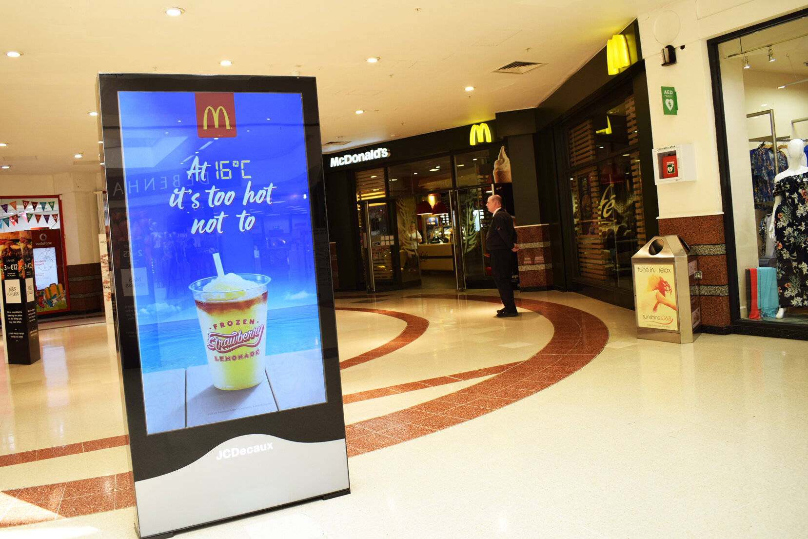
In recent months, our dynamic platform has enhanced a number of campaigns. With access to data such as weather, traffic, time, location, etc; designs for Digital Out of Home can be given an extra dimension. McDonald’s have done a couple of activations where copy displayed the temperature and suggested one of their Iced drinks range. Diageo have also used it to promote upcoming games for Rugby and GAA.
Out of Home presents many exciting opportunities to stand out. Creative bravery can be risky but my experience tells me the rewards should outweigh any reluctance on an advertisers part. Creative solutions for OOH come in many shapes and sizes and can be an exciting part of a brands journey. A quote I came across sums this up well, “Design is an opportunity to continue telling the story, not just to sum everything up “ – Tate Linden.


